This article is part of my highlights of the IEEE VIS 2020 conference. Of course, the talks I selected are those that lie closest to my own research; there were many more interesting presentations. I have provided links to the conference website and the presentations on YouTube, skipping ahead to the actual start.
This part focuses on machine learning and visualisation. The topic is closely related to the previous part about explainable artificial intelligence because visualisations are often used as explanations. However, the visualisations in this overview give insights into the training process and vulnerabilities of machine learning models. The first talk also illustrates that machine learning and information visualisation can form a wonderfully synergetic pair outside the field of explainable artificial intelligence!
MLUI 2020: Machine Learning from User Interaction for Visualization and Analytics
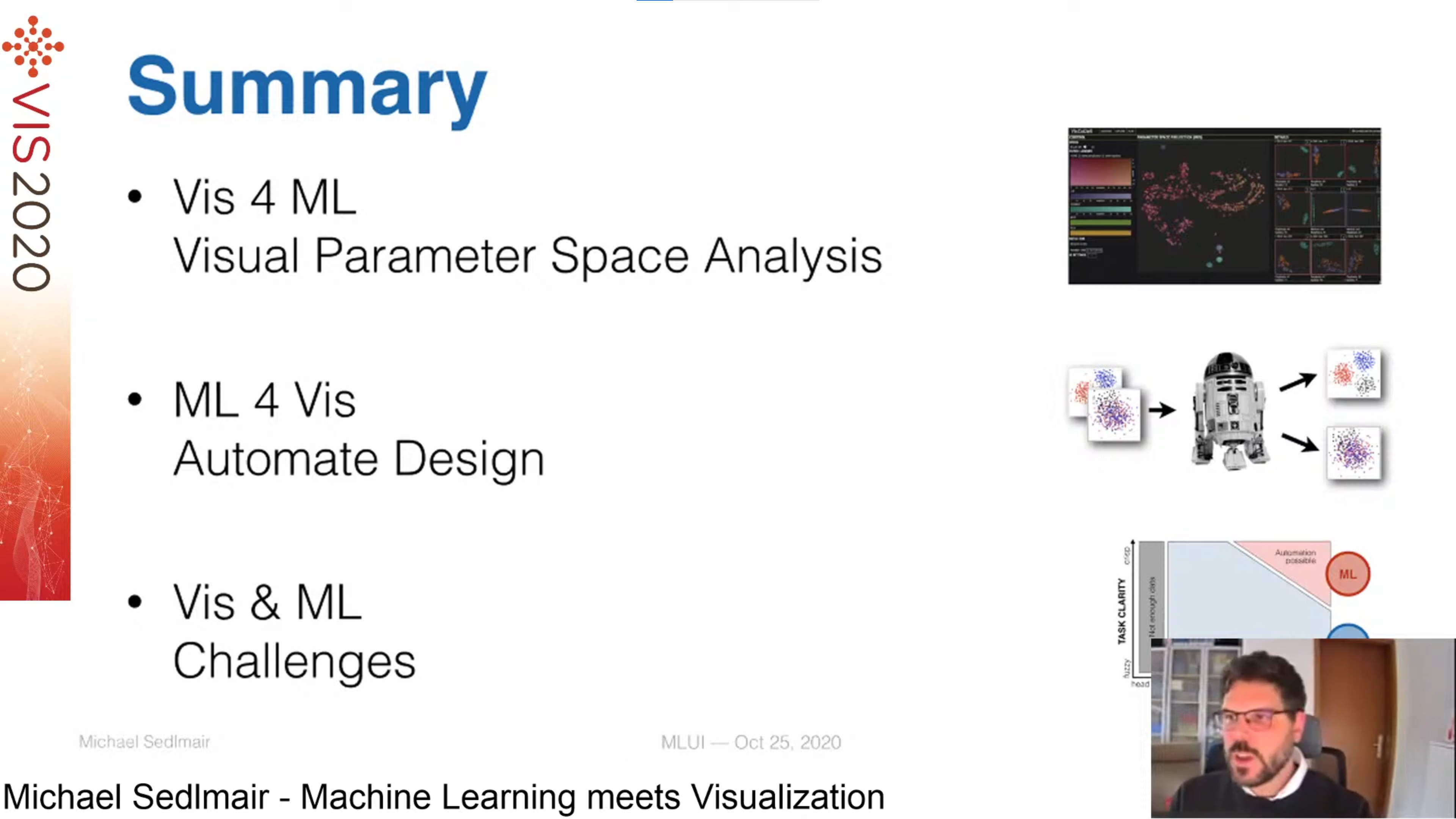
This session started with the great keynote Machine Learning meets Visualization by Michael Sedlmair, which discussed how machine learning (ML) and visualisation (VIS) can benefit from each other:
- VIS for ML: an example is analysing the parameter space through visualisations (e.g. a meta-map of projection plots grouped by similarity)
- ML for VIS: improve visualisation with ML (e.g. separate cluster in projection plots, or colour plots such that they are most readable)
- VIS and ML: challenges for combining both fields include solving "real problems" by interacting with data rather than complex visualisations, interactions beyond brush-and-link and when humans should be involved in the loop, scaling up visualisations for large data sets and progressive analytics.
Vulnerabilities in Machine Learning
This session presented 6 examples of how visual analytics can help in detecting and avoiding vulnerabilities while training machine learning models. I highlight 3 of them, which each cover a different vulnerability.
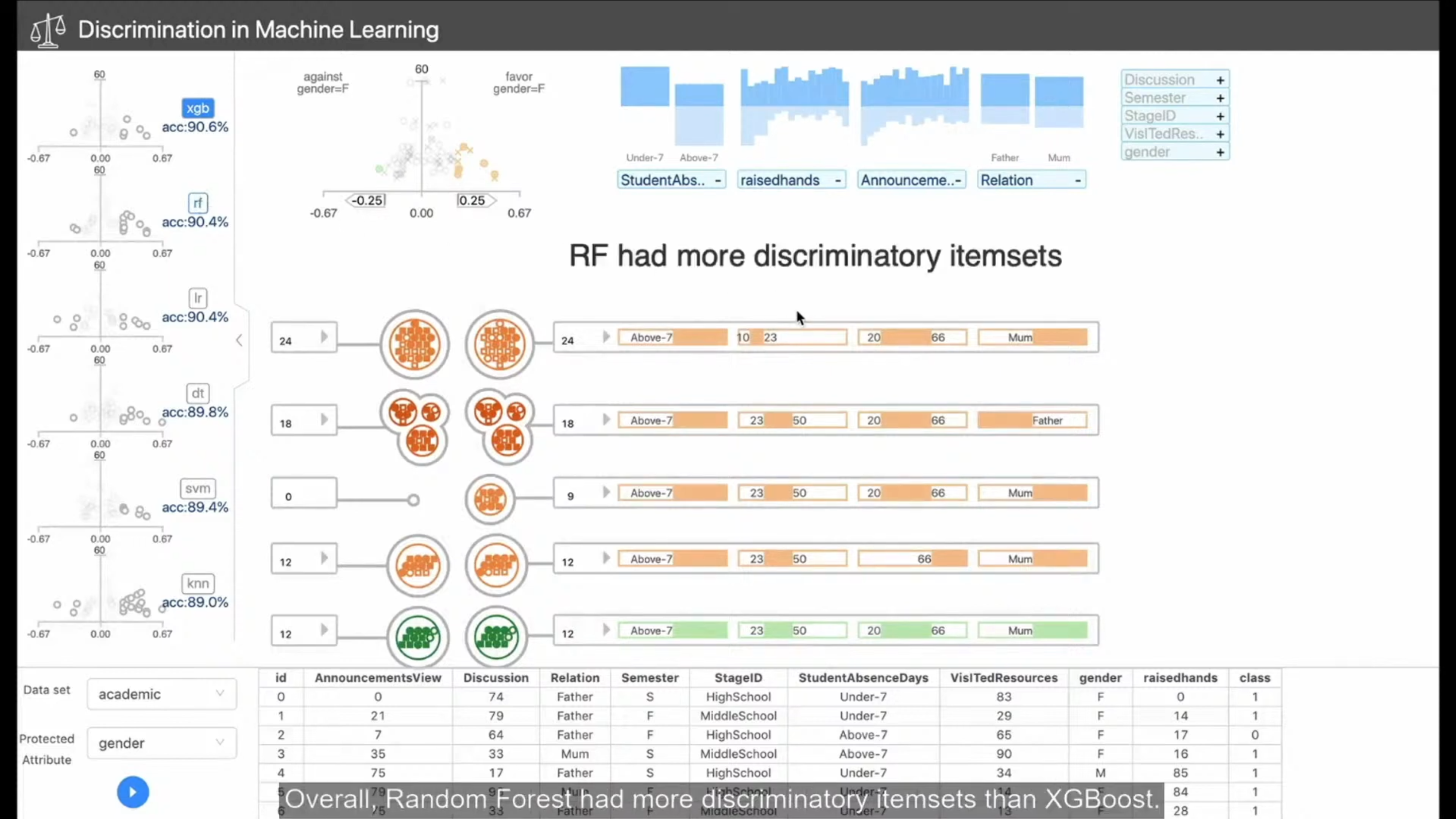
Talk 1. Visual Analysis of Discrimination in Machine Learning by Qianwen Wang. A visual analytics system for detecting discrimination in model outcomes. The visualisation contains RippleSets, a circle packing that adapts classical Venn diagrams. The system also allows comparing different models by discrimination.
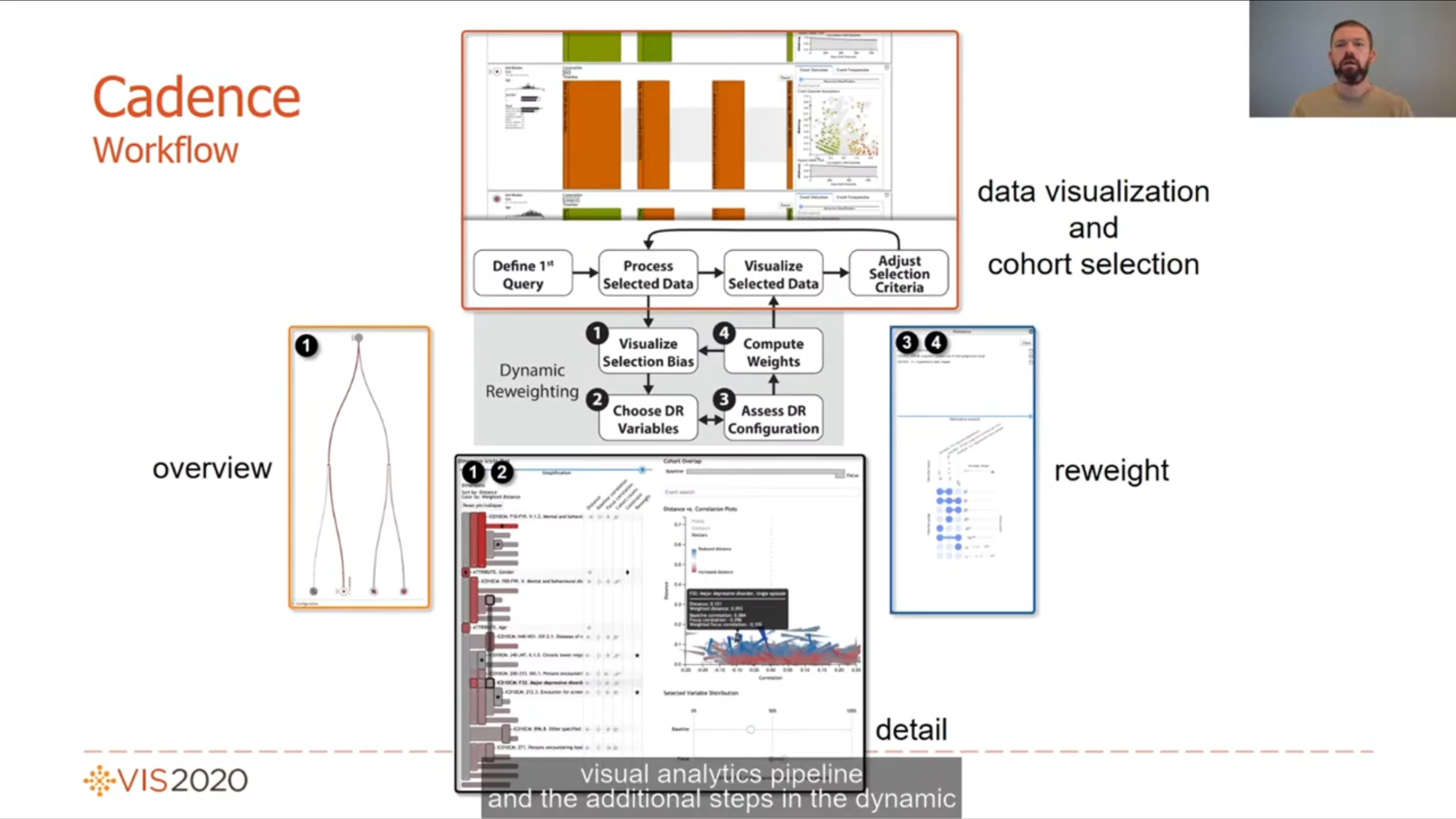
Talk 2. Selection-Bias-Corrected Visualization via Dynamic Reweighting by David Borland. Training models on particular subsets of the full data set can introduce bias. This selection bias is visualised in an icicle plot, and can be corrected with dynamic reweighting. The presentation contains a nice demo of the visual analytics system working on a large medical data set.
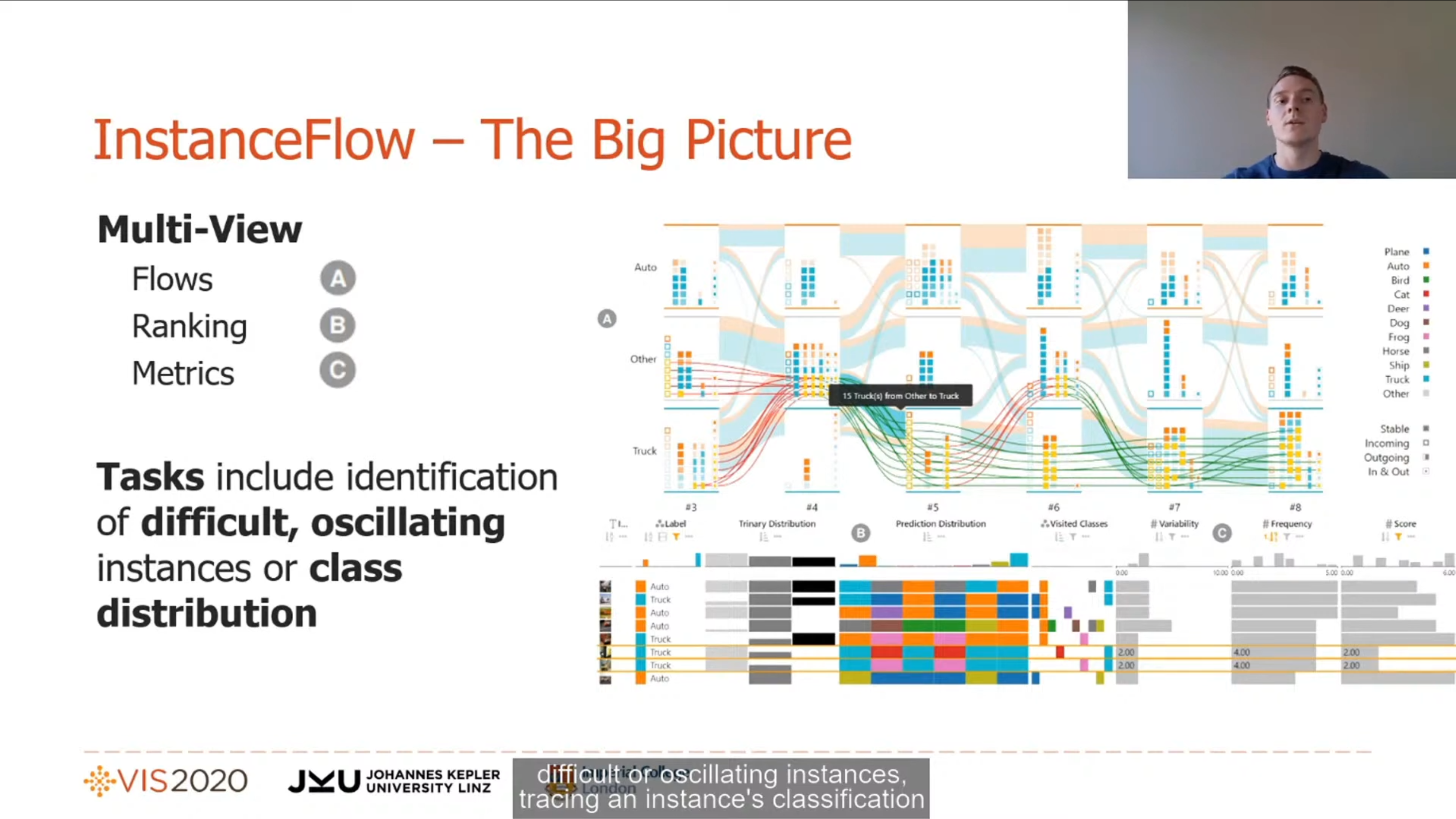
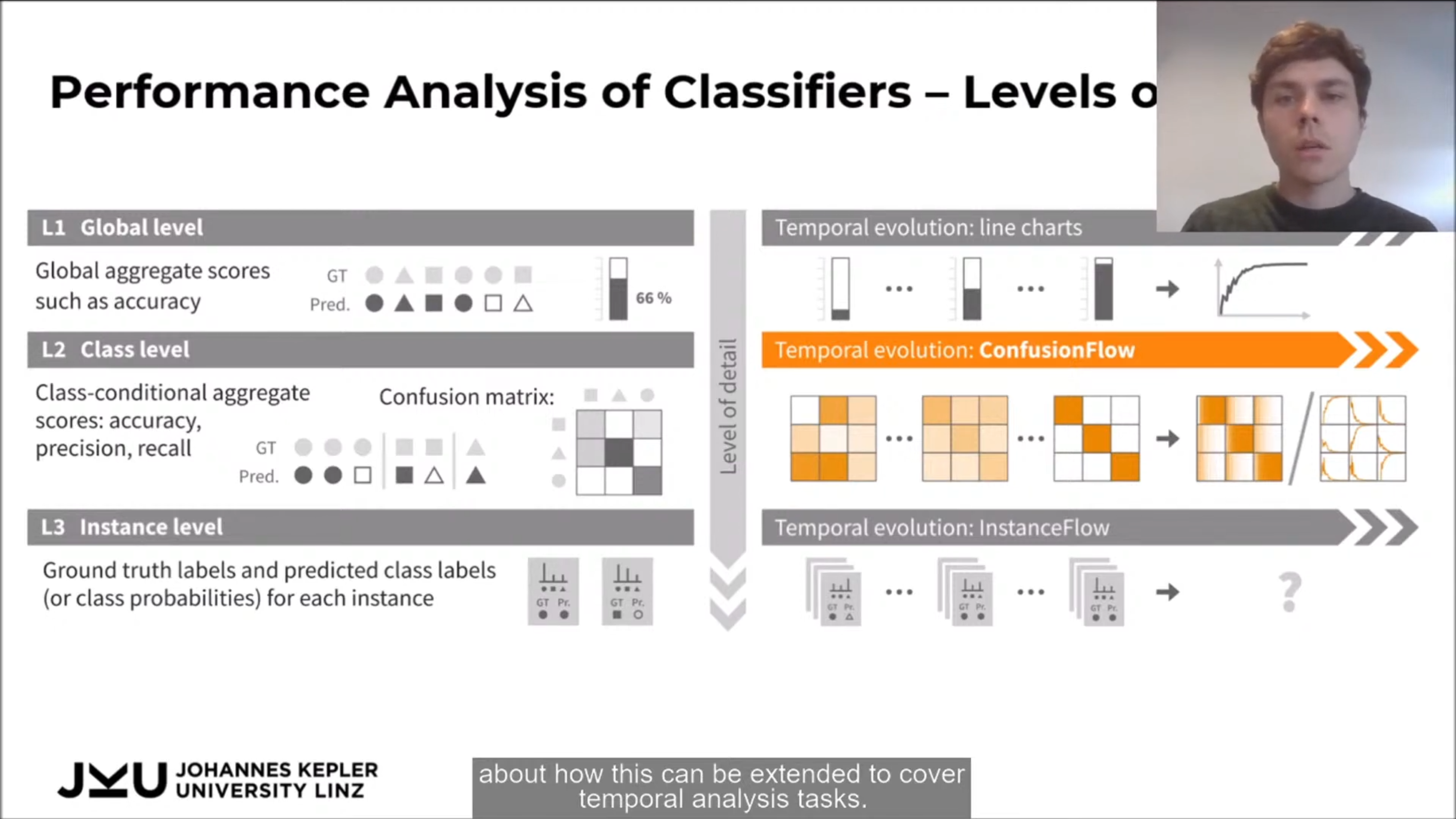
Talk 3. ConfusionFlow: A model-agnostic visualization for temporal analysis of classifier confusion by Andreas Hinterreiter. Visualisation for the evolution of a model's confusion matrix over different training iterations (epochs), such that quick changes in performance metrics like accuracy can be easily detected. The presentation also mentions 3 levels on which classifiers can be analysed: global, class, and instance.
Visualizing Machine Learning
This session contained visualisations for the outcomes of several types of machine learning. I particularly liked InstanceFlow: Visualizing the Evolution of Classifier Confusion on the Instance Level by Michael Pühringer, which is a kind of sequel to ConfusionFlow (see above). The visual dashboard shows how an algorithm classifies instances over different training iterations (epochs), which allows identifying instances that are hard to classify.