In 2020-2021, I contributed to the BigDataGrapes project (bigdatagrapes.eu), which was part of the European Union's Horizon 2020 research and innovation programme. The project studied how big data can benefit agriculture and natural cosmetics, particularly wine and food industries. I focused on price prediction for food products and developed an interactive visualisation with Meteor, React and D3. My work was showcased during a webinar entitled "Predictive Analytics for Food Risk Prevention: Towards visually appealing & highly interactive predictions". Watch the demo (no audio) or give it a try yourself at http://picasso.experiments.cs.kuleuven.be:3541!
What the visualisation shows
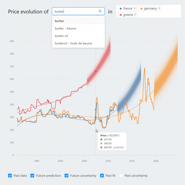
The text boxes at the top allow to enter one of over 400 products and respective European countries. A standard line chart then shows the product price evolution over time, which facilitates spotting trends, and comparing countries or similar products. Hovering the visualisation reveals a tooltip with details like date and price.
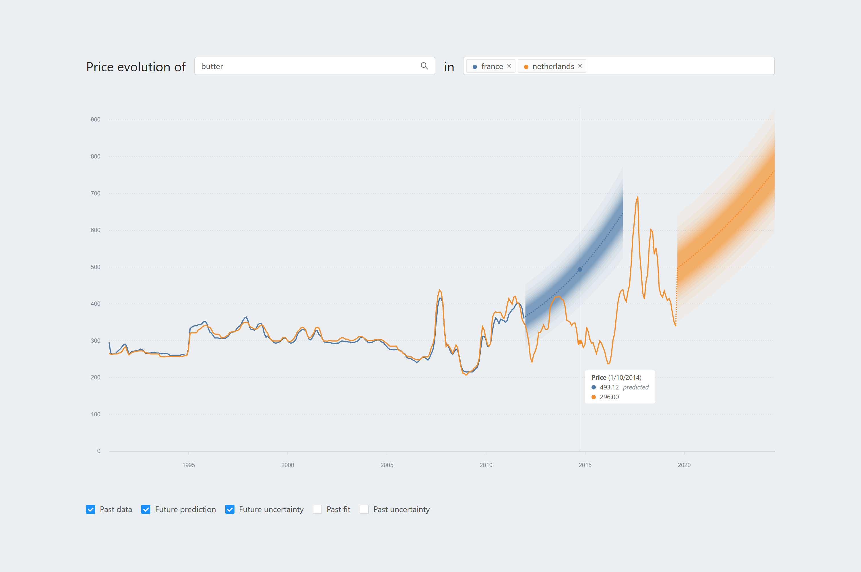
Five checkboxes at the bottom add or remove components in the visualisation.
- Past data. The available price data in the dataset, visualised as a full line.
- Future prediction. A prediction of the product price for 5 years, based on the past data, visualised as a dotted line. For illustration purposes, I used multiple linear regression. Of course, the same visualisation can be used with more advanced prediction methods too.
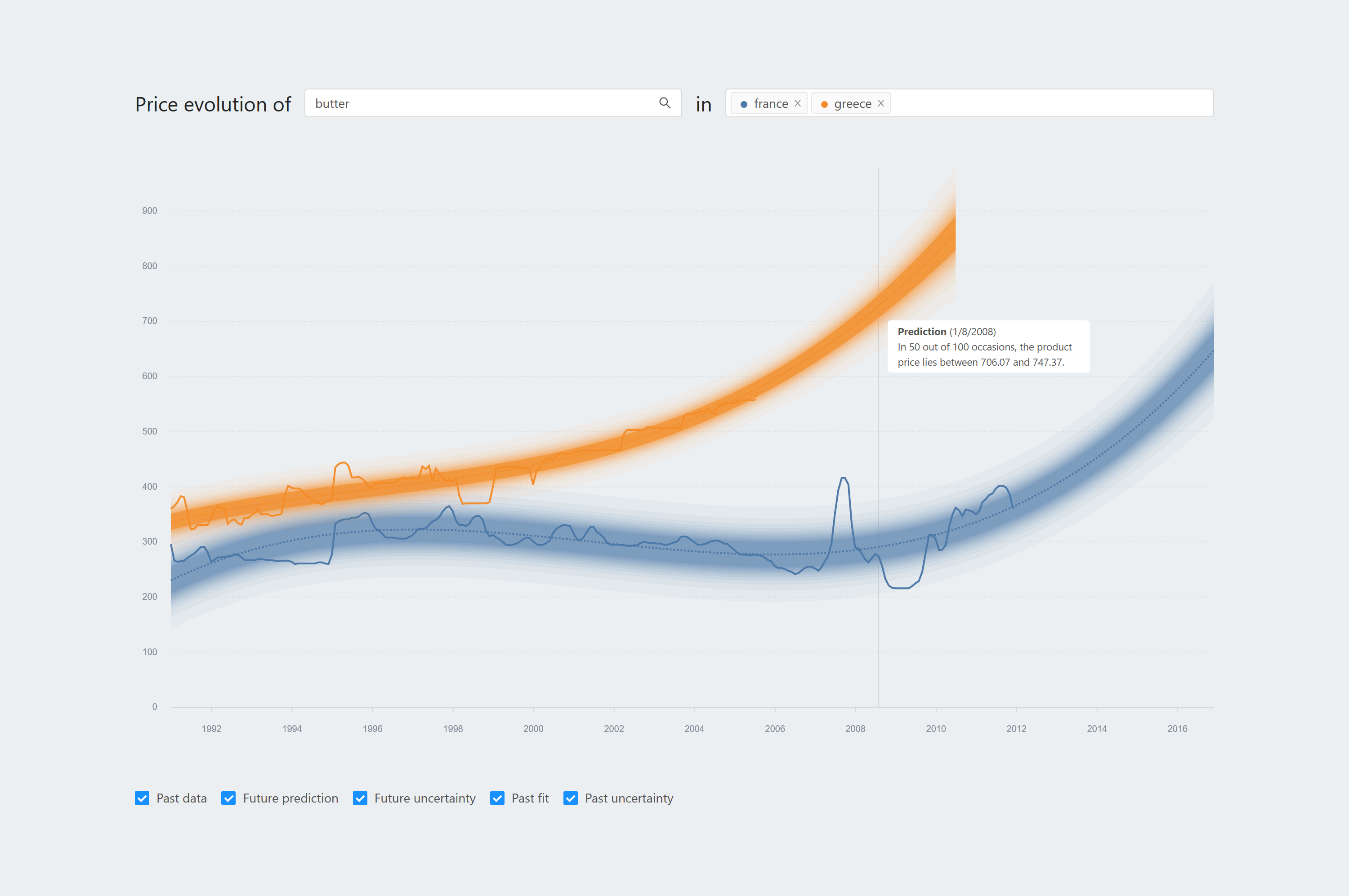
- Future uncertainty. Predicted values are estimates for the real future prices; they are not 100% certain. It is important to communicate this uncertainty, here visualised as coloured bands. For example, one such band shows how certain the model is about the actual future value lying between two values.
- Past fit. This is an approximation of the past data by the prediction model, also visualised as a dotted line. A past fit close to the past data suggests that the prediction model performs well for the past, which might raise confidence in the future prediction.
- Past uncertainty. Like the uncertainty in future prediction, there is also uncertainty in the past fit. These uncertainties are visualised similarly.
Research on trust and understandability
Designing and coding the visualisation was big fun, but I also wanted to use my visualisation to study two things:
- How do the visualisation components affect people's understanding of the prediction model, without me telling them how it works?
- How do the visualisation components affect people's trust in the prediction model?
To answer these questions, I interviewed 11 people who are active in agrifood industries or research. It was an exciting experience to interview people from Greece, Italy, Australia and Tunisia for 1-2 hours! The participants' detailed feedback and interaction with the visualisation gave me many insights in the above questions. Papers about the results are in the make.
